

how to
ENTER YOUR IMAGES
The closing date for submitting your entries is MONDAY 16 MARCH at Midnight.
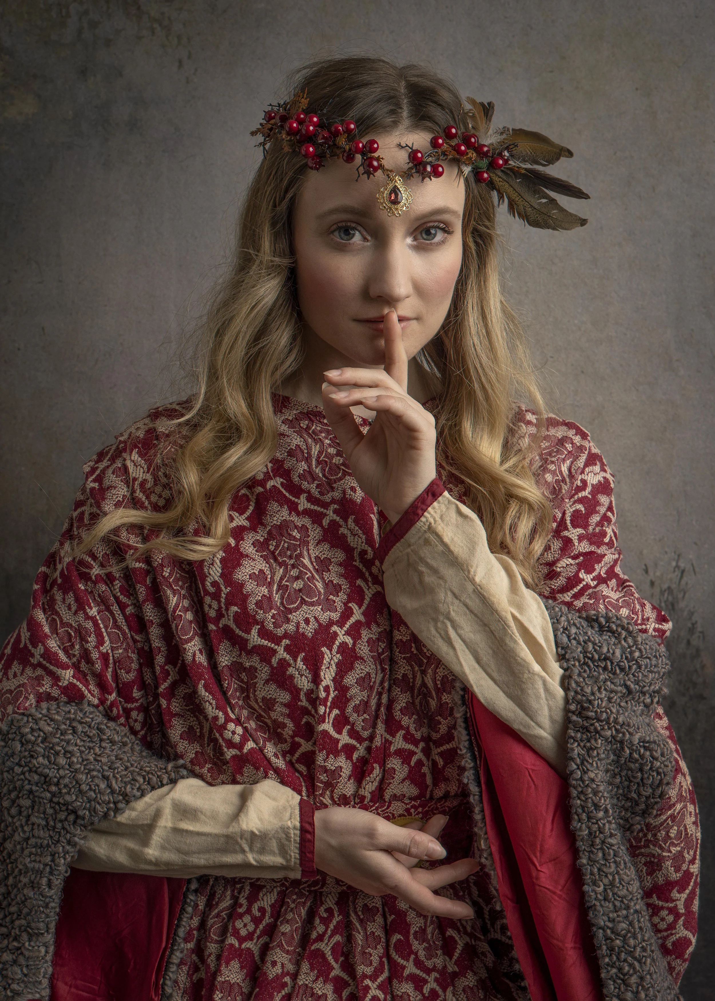
Straight out of camera image by Tracy Edwards, 2025
Julie will check the entries you have submitted to make sure they are in the correct format before forwarding onto the Judges in a simple number format.
YOUR ENTRIES WILL BE SENT TO THE JUDGES ANONYMOUSLY SO DON’T KNOW WHO YOU ARE!
Preparing your Images for Submission
Thank you so much for coming along to the Tracy Edwards Challenge Cup for Creative Photography. I hope that you had the most amazing day! It was so interesting for me to see how you all interpreted the Four Seasons in your own unique way. Very well done!
It’s nearly time to submit your image/s into the competition and here, you can find all the details how to do that correctly plus a comprehensive checklist of things to consider from a Judging point of view.
The price you paid to attend the charity photoshoot challenge includes one entry into the competition.
ADDITIONAL ENTRIES CAN BE PURCHASED FOR A FEE OF £10 EACH.
100% of all entry fees will be donated to Tracy’s Charity of choice, Shooting Stars Cancer Care in Wrexham.
-
Please add your name to each image file before sending them to me so I can keep the files organised on my computer.
I am then going to then send them on to the Judging Panel anonymously in a simple number format. Thank you.
-
JPEG format, high resolution files only (300dpi)
Colour space - sRGB
-
3000 px down the longest side. Maximum of 300 dpi
-
300dpi
-
If you would like to submit more than one image you can of course do that! Additional entries are £10 each.
Here is the payment link
https://www.paypal.com/ncp/payment/HGZUJ69SSVHLC
All the proceeds will be going to Tracy’s charity of choice, Shooting Stars Cancer Care in Wrexham who supported her magnificently.
-
Please email your images to Julie via email. ‘hello@julieherbertadams.com’
If you wish to submit more than one image you can do so using WeTransfer for large files transfers.
-
Finally, whilst we all appreciate that Photoshop is becoming more and more ingrained with Ai, this is a competition where your own artistry in photography is being judged. Please do not use keywords to generate content for your images. Instead, celebrate your own unique talents as a creative photographer.
What the Judges will look for
Our Judges have a set criteria to consider when viewing and critiquing your competition images. This criteria is based on the fact that photography is a combination of art and science.
Take a look at the 12 points listed opposite that our Judges will consider when viewing all the entries.
Further notes on submitting your entries.
When submitting - Don’t miss the obvious!
The most common reasons entries get marked down in competition are usually the obvious, missed. Below are some of the regular ‘obvious misses’ –
• There should be no business or personal logos on an entered image, yet this is regularly done, and those images are instantly disqualified.
• Lines that should be straight should be straight, yet this is missed several times a month, so watch your verticals and horizontals (especially in the background).
• Subjects are sometimes too central with surplus space on either side (containing distractions) which does not contribute to the story within the image. Don’t be afraid to frame (crop) things tighter in such circumstances.
• Watch for potential distractions from the subject in the foreground or background, including bright colours or light spots, and branches or other objects by a subjects head.
• Generally speaking, the tips of items (fingers, toes or dresses etc.) should not be cut off by the frame (crop) - unless an obvious close-up and intentional which supports the overall intention of the image-maker.
• White should be white, so watch for blue/purple/green/red tints etc. Make sure the White Balance is correct.
• The Judges like detail, so watch for the over-exposure or loss of detail in ‘blown-out’ whites or ‘blocked’ blacks. The detail should be there!
• Vignettes are regularly applied, yet they are not necessarily a good thing. If applied, they need to be congruent to the image and generally should be subtly blended in. Heavy vignettes can draw the viewer’s eye from the subject.
• Post-production is sometimes overdone, over-sharpening of an image creates a halo and is visible around subjects, artefacts left or chromatic aberration is clearly visible.
• If too much skin smoothing is overdone, it can flatten a subject’s dimensionality. Our faces are not flat but are full of contours, shadows and shapes. Our skin is not one colour but a variation of many tones and hues.
• Textures sometimes intrude onto the subject when they should just be in the background.
• It’s very frustrating to see obvious dust spots spoiling otherwise stunning images (the positive thing is that it tells photographers they have an issue).
-
This is the sense one gets upon viewing an image for the first time. Compelling images evoke laughter, sadness, anger, pride, wonder or another intense emotion.
-
Judges will look for a finished, polished look. Borders are permissible if it supports the overall impact of the image.
-
Judges consider the quality of the image itself as presented for viewing.
-
The use and control of light is central to photography and critical to Judges. Regardless of whether the light applied to an image is artificial or natural, Judges will look for the effective use of it in order to enhance an image and the purpose of use.
-
This is the approach used to create the image. Colour toning, lighting, posing, capture, expression, presentation media, and more are part of the technique applied to an image.
-
Judges look for the original, fresh, and external expression of the maker’s imagination to convey an idea, message or purpose.
-
This refers to the image’s ability to communicate to the viewer and evoke imagination and emotion.
-
This should always be appropriate to the story being told in an image.
-
Judges look at the effective use of colours and tones in an image. An image in which the tones work together, effectively supporting the image, can enhance harmony. By contrast, a lack of harmony can be used to evoke diverse feelings for effect.
-
This is central to creating an image and should bring all the visual elements together in concert to express the purpose of the picture. Proper composition holds the viewer in the image and prompts the viewer to look where the creator intends. Effective composition can be pleasing or disturbing, depending on the intent of the image-maker.
-
This focuses on the image where the photographer wants the viewer to stop as they view the image. There can be primary and secondary centres of interest, and occasionally there will be no specific point of interest as the entire scene collectively serves as the focus of interest.
-
Judges look for a specific style, i.e. your specific style. This can be defined in several ways. It might be defined by a specific genre or be recognisable as the characteristics of how a specific artist applies light to a subject. It can positively impact an image when the subject matter and the style are appropriate for each other, or it can have a negative effect when they are at odds. There is also an overriding arch to all the above – “Congruence or Harmony”.
In other words, all the components above must work together to create ‘one’. The strongest submissions are cohesive and evidence consistency in all areas.
TOP TIP!
Turn your image upside down, close your eyes, then open them and think about where your eyes are drawn. Simply by doing this, you will become emotionally detached from your image and spot any distractions pulling your eye from the focal point (bright areas etc.).
View your image at 100% as the Judges will. This way, you can spot things like dust spots and postproduction issues such as halo’s, textures overlapping subjects, repetitive cloning etc.
I hope that I have covered everything in this rather detailed page of the website! However, if you have any questions at all, please don’t hesitate to email me for assistance.
Thank you once again for your support that truly means the actual world to me.